Interpret NDVI median and variance plot - using 2008 data as an example


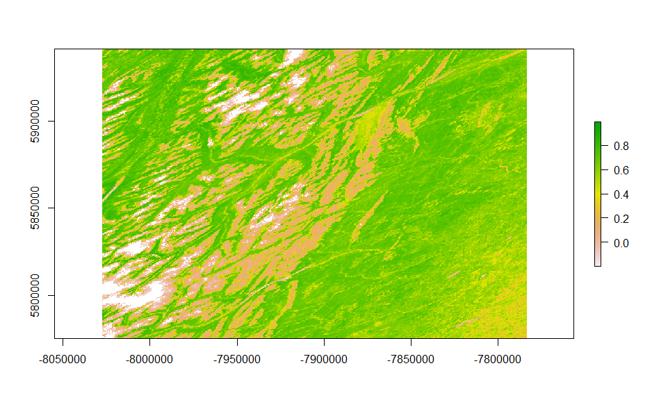
From the median NDVI plot, the pure white indicates no data. Very low values of NDVI showing as red in the plot represent barren areas of rock, sand, or snow, while moderate values
showing as yellow indicate shrub and grassland. High values showing as green represent
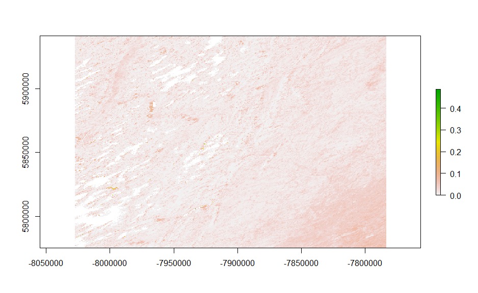
forests. From the variance plot, generally pixels with moderate NDVI values have higher
variance. Pixels with low and high NDVI values usually have relatively lower variance. There
may be multiple species of shrubs, grassland, or tree seedlings, thus, the NDVI values may
vary more than barren areas or mature forests.
Interpret the temporal trend of the median NDVI values - using 2010-2012 for example

The median NDVI does not change uniformly over the landscape.
- dark grey / black: There is no change in median NDVI values between 2008, 2010, and 2012. These pixels remain low NDVI values. It may indicate that the barren areas remain stable.
- light grey / white: There is no change in median NDVI values between 2008, 2010, and 2012. These pixels remain high NDVI values. It may indicate that the vegetation cover there remain stable.
- shades of red / yellow / orange: The median NDVI value of 2008 is different from the
following two years. Red indicates that there was vegetation in 2008 which was removed
later. The shade of yellow and orange is a mix of red and green bands, thus, there may be
vegetation in 2008 and 2010 which was cut in 2012. - shades of blue: Only pixels representing 2012 have NDVI values that are higher than 0. There was no vegetation in 2008 and 2010, however, vegetation appeared in 2012.
- green: Only pixels representing 2010 have NDVI values that are higher than 0. There was no vegetation in 2008, however, vegetation appeared in 2010 which was cut later in 2012.
- purple / pink: Purple or pink is a mix of red and blue. Therefore, only year 2010 shows no NDVI values. There was vegetation in 2008 which was removed in 2010 and grew back in 2012.
Examine NDVI data validity by month - using 2008 as an example


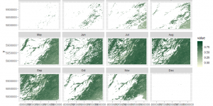
From the levelplot, during the winter time and early spring (December to April), there was
nearly no NDVI values recoded. Due to the large amount of missing data in winter and early
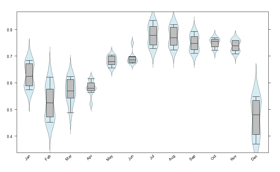
spring, NDVI values are not valid throughout the entire year. The boxplot shows that
April to June and October to November have relatively lower variance which may indicate
less uncertainty. However, since the winter and early spring have higher probability of
missing data, June to September may have more reliable/ usable data.
