Check out the interactive map to visualize heart disease mortality rate change between 1999 and 2016.
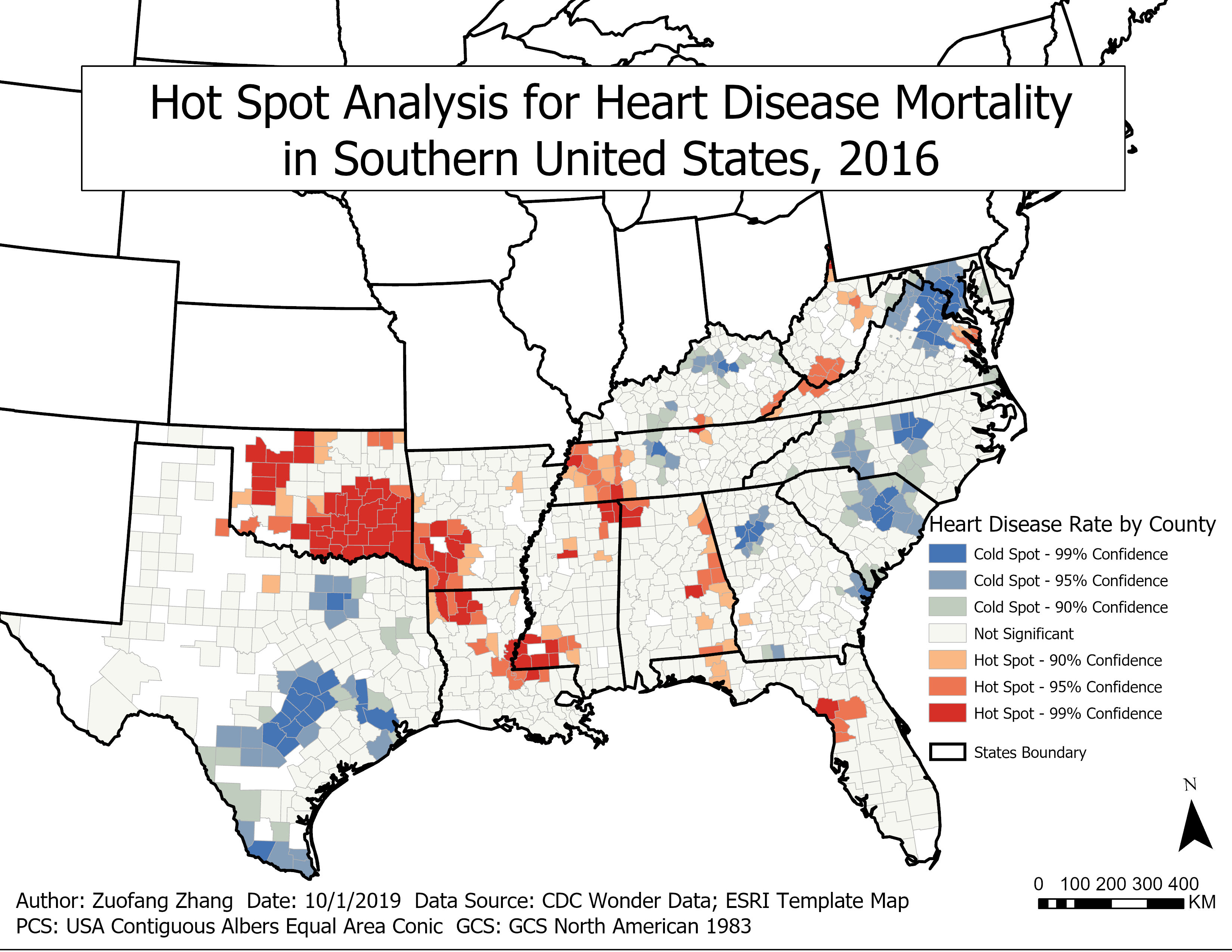
Hot spot analysis is used to identify whether high or low values cluster spatially. A hot spot is an area where people have a higher than average risk of getting heart disease, while a cold spot has less than the average mortality rate. There are three confidence levels which are 90, 95 and 99 percent. A confidence level of 99 percent is the most conservative.
As shown in the map, heart disease mortality is not spread evenly across counties in the Southern United States. The hot spot analysis indicates that high or low mortality rates tend to cluster spatially. Hot (red hues) spots are areas with significant clustering of counties with high mortality rates and cold (blue hues) spots are clustering of counties with low mortality rates. However, most areas in the Southern United States had a grey color indicating that there was no statistically significant clustering. Counties with higher mortality rates were located in the middle part of the Southern United States, while cold spots were usually found in either western or eastern areas within the Southern United States. In 2016, Oklahoma had the most hot spots. Nearly all counties within Oklahoma were considered as hot spots indicating that people there had a higher than average risk of heart disease mortality. Additionally, Arkansas, Louisiana, Mississippi, Alabama, and Florida all had hot spots. Nearly all counties in Washington DC and Southeastern Texas were considered as cold spots of heart disease mortality. Virginia, North Carolina, and South Carolina also had significant clustering of low mortality rates. Virginia, Tennessee and Kentucky had both cold and hot spots. More counties in Tennessee had higher than average death rates while more counties were clustered into cold spots in Virginia and Kentucky.
The overall pattern of mortality rates did not change significantly from 1999 to 2016. Oklahoma had the most hot spots over the years while Texas had the most cold spots. However, the total number of cold spots slightly increased while the total number of hot spots slightly decreased. For example, West Virginia and Florida used to have higher percentages of counties with high mortality rates in 1999 than in 2016.